
Wouldn't it be cool if you could link up all the power of modern-day machine learning and artificial intelligence tools with the interactivity and quick feedback loops of modern software development paradigms and pipe that directly into your plotter to make art like this?

Introduction
Today we're going to run through how to make plotter art in Python. The nice part is once we know how to do the basics in Python, we get the rest of the Python ecosystem for free (web frameworks, most modern-day data-science tools, AI+ML+CV tools, etc) and now suddenly the sky is the limit for making complex designs and interactive art.
The tools and libraries we are going to cover in this python plotter tutorial are:
Numpy + Scipy + Matplotlib to create our core design
Jupyter Lab Notebooks for easy iterative development
Ipythonwidgets for interactive designs
Vpype for SVG post-processing
(Optional/Advanced) Axidraw Python Client for directly talking to your Axidraw
And the links you are going to need are:
(Optional) The Axidraw Python Client installation guide
For this tutorial, I'm assuming some basic software development skills - the ability to get Python libraries installed on your own, simple terminal usage, and copying and pasting from Github.
Basic Idea

The first piece of this generative art composition is called a Voronoi diagram. While they aren't too complicated, the specifics are a bit outside of the scope of this essay, and all we really have to know about it is that it's a process that takes in a bunch of 2D points, and generates a list of 2d polygons that looks like the picture above.
The next step will be to fill in some of the polygons. The fill we are going to work with is also fairly straightforward, it's just a polygon where we are shrinking the polygon down to a point.

The Basics - Installation and Notebooks
Let's get this show on the road!
The Readme has all of the steps you need to get everything installed (except the Axidraw Client, but more on that later), and getting your Jupyter set up and running. The requirement.txt will have all the libraries we need and should be pip installable.
We're going to use Jupyter notebooks because they are awesome. Effectively notebooks are a cross between a text file and a RELP. How they work is that you can write code in blocks, and then execute the blocks in any order, change them, and execute them again. This lets you easily try something, see what happens, and quickly change it without having to rerun your whole program.
Getting an Initial Design
Enough talking let's make art!
For this section, you want to be looking at this notebook. This notebook has a line by line breakdown with printouts, so if you're new to any of this I'd strongly recommend taking a look at that.
The first thing we want to do is size our canvas. I typically use 11x14 pieces of paper. The idea here is we want our polygons to extend beyond the edge of the frame, so are a bigger area (x/y_bounds) to make our polygons, and then actually displaying them in an 11x14 area.
Remember how I said that a Voronoi diagram takes in points and gives you polygons? Let's make those points. This code will make you 200 points in our big box that we can give to our Voronoi function.
And that should give us something that looks like this

The only thing really worth noting is that the closer together the points are in this diagram, the smaller the polygons will be in that area.
Now we're ready to see what our diagram looks like. This code takes our points, makes a diagram, and graphs it. What's happening here is that the Voronoi function doesn't return us a list of the polygons, instead, it gives us a big matrix of all the vertices and an ordered lists that tell us what vertices make up a polygon (so [0,1,2,3] means we have quadrilateral which uses the first four vertices).
So to use what the Voronoi function returns, first we filter out some invalid polygons, and since we are going to treat the polygons as a bunch of lines we need to close the polygon (ie trying to draw [0,1,2,3] would give us 3 lines from 0->1, 1->2, 2->3, but we would be missing 3->0).
And we will get a diagram something that looks like this

Now we are just missing one piece, and that's how to fill in the pattern for our polygon!
There is a simple math trick to do this. The idea is - if we have a shape that is centered at (0,0), then to scale that shape by S, we can just multiply all the points by S. So all we have to do is take a polygon, center it, scale it down a bunch of times, and then move the polygon + fill back to the starting location. Then once we can do it on one polygon, we can do it on as many as we would like!
The code to do all that looks like this
And visualized step by step
Adding Interactivity
Now we are ready to turn it up to 11!
For this section, we will be working with this code on Github.
As you may have noticed, we've picked a lot of numbers that influence how our design looks, and we haven't been trying to pick them very carefully! You might be thinking "well this looks okay so far, but what would happen if we used more points? Or less fill lines?". Now you could just change those numbers and rerun the program from that point on, but that's rather cumbersome to do over and over.
One of the challenging things with making complex numeral programs is often times they require a lot of parameters as inputs and apriori you don't know what numbers work well or how they affect each other. Luckily for us, the library ipywidgets. Ipywidgets works with notebooks and provides an easy wrapper around functions that lets you easily change function inputs with slides, buttons, etc and it reruns your function so you can see what happens.
To add all this interactivity all we have to do is wrap our code in a function, give our input variables some default values, and (optionally) we can tell the wrapper function what values make sense, for example, floats take a (min value, max value, value increment). Once we do this the library will autogenerate us an interactive widget.
To do this we are going to run the code
There are a few additions to this code that wasn't in our last notebook that is worth discussing. Before we were just filling in one polygon, but now we want to fill in a lot of them. To do this I'm just randomly picking some percent of all of them by doing
Next, we are changing a few things about how we are plotting. I added a debug option, where if we don't have debugging enabled we get a clean graph with no axis lines, tick marks, or anything like that so we can just go ahead and plot it. However when we have debugging enabled it lets us see that so we can get a sense of scale, where everything is, etc.
Finally, I added a no-op toggle button called toggle_for_new which doesn't do anything but will force the function to make a new design with the same parameters. This is useful in the case where you like the design looks in terms of what you can influence with the parameters, but you don't like the specific composition so you just want to re-run it.
Now you should see some sliders appear

And when you adjust them it will change the design!
Now we've gotten to the fun part of the tutorial. Right now you need to play around with things until you get something you like!
Some things you could explore at this point
Right now we are using a fixed number of lines for the fill. What would this look like if it were different per polygon?
What if we made the initial points differently instead of using np.random.uniform?
What would change if the scalars used to make the fill weren't evenly spaced?
What if to make the fill each time you scaled it down you also rotated it a bit?
Printing your plot
“The thing about finishing a story is that finishing is really only the beginning.” - William Herring
We're almost there. The only things we have left are saving our results, formatting it, and printing it. Matplotlib lets us save directly to SVGs if we use that file extension, so we will go ahead and do that.
And for formatting + printing, we have two options.
Option 1 is to use Inkscape. This was covered in another tutorial.
Option 2 is to use Python tools.
Since this is plotting in Python tutorial we are going to use option 2, but option 1 is okay in general too.
To do the formatting we are going to use Vpype. Vpype is a command-line tool built-in Python and it shines when it comes to changing size or alignment, merging multiple SVGs into one (if you want to use multiple colors for example), simplifying the SVGs for speed, and much more! Since we are just making sure our SVG is the right size to fit on a page, doing this is relatively straightforward. I've provided two example commands. One is for 11x14 (since that's what I've been using in the examples), but since you are likely printing on letter paper I threw that in too. The numbers I'm scaling to are just 90% of the paper dimensions to give us a margin, and we know our art won't get distorted because we picked the canvas size.
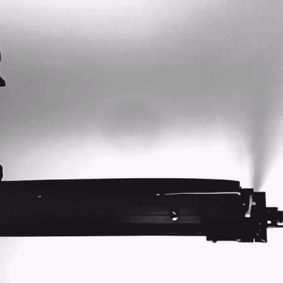
Now we just have to print it with our pen plotter. To do this we are going to use the Axidraw API. I've marked this part as a bit more advance just because the installation is a bit wonky (it's not too difficult, but it's also not just pip installing). If you don't want to deal with that then you can just use Inkscape at this point.
(Optional/Advanced) Axidraw Python API
It's time to let the Axidraw loose...
Alright so go here and get that software installed.
Once that is up and running, just having it read and plot the file is very straightforward.
However, this will only work if you've already calibrated your pens to work with your current config. If you want to be able to calibrate your pen height (for example you just put in new pens). You can run it in interactive mode. I use the following code with the different chunks in different notebook cells so I can just keep tweaking it until I'm ready to print.
Now for people out there that are used to plotting, this might seem like a lot of work compared to Inkscape (and to be honest it is! I end up using Inkscape a lot). But it's worth mentioning because the Python API lets you do a lot of things that you can't otherwise do in Inkscape. For example, the Python API has an interactive mode that lets you stream commands directly to your Axidraw. That's cool because you could easily imagine doing something like hooking up your Axidraw to plot based on a live stream of data from a Kinect or some sensor.
Conclusions
Congratulations! You did it.
I'm assuming if you got all the way through this then you think making software to make robots make art is pretty cool. If you want to see more awesome plotter stuff from me like what you just read or this artwork.
Then you can
See what art I've been making lately on Instagram
Check out my portfolio, essays, and most other good stuff I make on my personal website
Find some cool timelapse plotter videos on Tiktok
About the Author
Geoffrey is a generative artist living in San Francisco. His work is currently focused on exploring the intersection of formal and informal compositions by using randomness and statistical theory to create emergent patterns from noise.
Before he switched to generative art, he co-founded a YC startup Geopredict, was VP of engineering at a quantitative hedge fund Numerai, and was a research engineer at Google Deepmind. He holds a bachelor's in mathematics and a master's in mathematical statistics from the University of Utah.