Stylin’ with Pandas
Posted by Chris Moffitt in articles
Introduction
I have been working on a side project so I have not had as much time to blog. Hopefully I will be able to share more about that project soon.
In the meantime, I wanted to write an article about styling output in pandas. The API for styling is somewhat new and has been under very active development. It contains a useful set of tools for styling the output of your pandas DataFrames and Series. In my own usage, I tend to only use a small subset of the available options but I always seem to forget the details. This article will show examples of how to format numbers in a pandas DataFrame and use some of the more advanced pandas styling visualization options to improve your ability to analyze data with pandas.
What is styling and why care?
The basic idea behind styling is that a user will want to modify the way the data is presented but still preserve the underlying format for further manipulation.
The most straightforward styling example is using a currency symbol when working with currency values. For instance, if your data contains the value 25.00, you do not immediately know if the value is in dollars, pounds, euros or some other currency. If the number is $25 then the meaning is clear.
Percentages are another useful example where formatting the output makes it simpler to understand the underlying analysis. For instance, which is quicker to understand: .05 or 5%? Using the percentage sign makes it very clear how to interpret the data.
The key item to keep in mind is that styling presents the data so a human can read it but keeps the data in the same pandas data type so you can perform your normal pandas math, date or string functions.
Pandas styling also includes more advanced tools to add colors or other visual elements to the output. The pandas documentation has some really good examples but it may be a bit overwhelming if you are just getting started. The rest of this article will go through examples of using styling to improve the readability of your final analysis.
Styling the data
Let’s get started by looking at some data. For this example we will use some 2018 sales data for a fictitious organization. We will pretend to be an analyst looking for high level sales trends for 2018. All of the data and example notebook are on github. PLease note that the styling does not seem to render properly in github but if you choose to download the notebooks it should look fine.
Import the necessary libraries and read in the data:
import numpy as np
import pandas as pd

df = pd.read_excel('2018_Sales_Total.xlsx')
The data includes sales transaction lines that look like this:
| account number | name | sku | quantity | unit price | ext price | date | |
|---|---|---|---|---|---|---|---|
| 0 | 740150 | Barton LLC | B1-20000 | 39 | 86.69 | 3380.91 | 2018-01-01 07:21:51 |
| 1 | 714466 | Trantow-Barrows | S2-77896 | -1 | 63.16 | -63.16 | 2018-01-01 10:00:47 |
| 2 | 218895 | Kulas Inc | B1-69924 | 23 | 90.70 | 2086.10 | 2018-01-01 13:24:58 |
| 3 | 307599 | Kassulke, Ondricka and Metz | S1-65481 | 41 | 21.05 | 863.05 | 2018-01-01 15:05:22 |
| 4 | 412290 | Jerde-Hilpert | S2-34077 | 6 | 83.21 | 499.26 | 2018-01-01 23:26:55 |
Given this data, we can do a quick summary to see how much the customers have purchased from us and what their average purchase amount looks like:
df.groupby('name')['ext price'].agg(['mean', 'sum'])
| mean | sum | |
|---|---|---|
| name | ||
| Barton LLC | 1334.615854 | 109438.50 |
| Cronin, Oberbrunner and Spencer | 1339.321642 | 89734.55 |
| Frami, Hills and Schmidt | 1438.466528 | 103569.59 |
| Fritsch, Russel and Anderson | 1385.366790 | 112214.71 |
| Halvorson, Crona and Champlin | 1206.971724 | 70004.36 |
For the sake of simplicity, I am only showing the top 5 items and will continue to truncate the data through the article to keep it short.
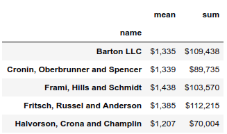
As you look at this data, it gets a bit challenging to understand the scale of the
numbers because you have 6 decimal points and somewhat large numbers. Also, it is
not immediately clear if this is in dollars or some other currency. We can fix that
using the DataFrame
style.format
.
(df.groupby('name')['ext price']
 .agg(['mean', 'sum'])
 .style.format('${0:,.2f}'))
Here is what it looks like now:

Using the
format
function, we can use all the power of python’s string
formatting tools on the data. In this case, we use
${0:,.2f}
to place a leading
dollar sign, add commas and round the result to 2 decimal places.
For example, if we want to round to 0 decimal places, we can change the format
to
${0:,.0f}
(df.groupby('name')['ext price']
 .agg(['mean', 'sum'])
 .style.format('${0:,.0f}'))
If you are like me and always forget how to do this, I found the Python String Format Cookbook to be a good quick reference. String formatting is one of those syntax elements that I always forget so I’m hoping this article will help others too.
Now that we have done some basic styling, let’s expand this analysis to show off some more styling skills.
If we want to look at total sales by each month, we can use the grouper to summarize by month and also calculate how much each month is as a percentage of the total annual sales.
monthly_sales = df.groupby([pd.Grouper(key='date', freq='M')])['ext price'].agg(['sum']).reset_index()
monthly_sales['pct_of_total'] = monthly_sales['sum'] / df['ext price'].sum()

We know how to style our numbers but now we have a combination of dates, percentages and currency. Fortunately we can use a dictionary to define a unique formatting string for each column. This is really handy and powerful.
format_dict = {'sum':'${0:,.0f}', 'date': '{:%m-%Y}', 'pct_of_total': '{:.2%}'}
monthly_sales.style.format(format_dict).hide_index()

I think that is pretty cool. When developing final output reports, having this
type of flexibility is pretty useful. Astute readers may have noticed that
we don’t show the index in this example. The
hide_index
function suppresses
the display of the index - which is useful in many cases.
In addition to styling numbers, we can also style the cells in the DataFrame. Let’s highlight the highest number in green and the lowest number in color Trinidad (#cd4f39).
(monthly_sales
 .style
 .format(format_dict)
 .hide_index()
 .highlight_max(color='lightgreen')
 .highlight_min(color='#cd4f39'))

One item to highlight is that I am using method chaining to string together multiple function calls at one time. This is a very powerful approach for analyzing data and one I encourage you to use as you get further in your pandas proficiency. I recommend Tom Augspurger’s post to learn much more about this topic.
Another useful function is the
background_gradient
which can highlight
the range of values in a column.
(monthly_sales.style
 .format(format_dict)
 .background_gradient(subset=['sum'], cmap='BuGn'))

The above example illustrates the use of the
subset
parameter to apply
functions to only a single column of data. In addition, the
cmap
argument allows us to choose a color palette for the gradient. The matplotlib
documentation lists all the available options.
Styling with Bars
The pandas styling function also supports drawing bar charts within the columns.
Here’s how to do it:
(monthly_sales
 .style
 .format(format_dict)
 .hide_index()
 .bar(color='#FFA07A', vmin=100_000, subset=['sum'], align='zero')
 .bar(color='lightgreen', vmin=0, subset=['pct_of_total'], align='zero')
 .set_caption('2018 Sales Performance'))

This example introduces the
bar
function and some of the parameters to
configure the way it is displayed in the table. Finally, this includes the
use of the
set_caption
to add a simple caption to the top of the table.
The next example is not using pandas styling but I think it is such a cool example that I wanted to include it. This specific example is from Peter Baumgartner and uses the sparkline module to embed a tiny chart in the summary DataFrame.
Here’s the sparkline function:
import sparklines

def sparkline_str(x):
    bins=np.histogram(x)[0]
    sl = ''.join(sparklines(bins))
    return sl
sparkline_str.__name__ = "sparkline"
We can then call this function like a standard aggregation function:
df.groupby('name')['quantity', 'ext price'].agg(['mean', sparkline_str])
| quantity | ext price | |||
|---|---|---|---|---|
| mean | sparkline | mean | sparkline | |
| name | ||||
| Barton LLC | 24.890244 | ▄▄▃▂▃▆▄█▁▄ | 1334.615854 | █▄▃▆▄▄▁▁▁▁ |
| Cronin, Oberbrunner and Spencer | 24.970149 | █▄▁▄▄▇▅▁▄▄ | 1339.321642 | █▅▅▃▃▃▂▂▁▁ |
| Frami, Hills and Schmidt | 26.430556 | ▄▄▁▂▇█▂▂▅▅ | 1438.466528 | █▅▄▇▅▃▄▁▁▁ |
| Fritsch, Russel and Anderson | 26.074074 | ▁▄▇▃▂▂█▃▄▄ | 1385.366790 | ▇█▃▄▂▂▁▂▁▁ |
| Halvorson, Crona and Champlin | 22.137931 | ▇▆▆▇█▁▄▂▄▃ | 1206.971724 | ██▆▅▁▃▂▂▂▂ |
I think this is a really useful function that can be used to concisely summarize data. The other interesting component is that this is all just text, you can see the underlying bars as lines in the raw HTML. It’s kind of wild.
Conclusion
The pandas style API is a welcome addition to the pandas library. It is really useful when you get towards the end of your data analysis and need to present the results to others. There are a few tricky components to string formatting so hopefully the items highlighted here are useful to you. There are other useful functions in this library but sometimes the documentation can be a bit dense so I am hopeful this article will get your started and you can use the official documentation as you dive deeper into the topic.
Finally, thanks to Alexas_Fotos for the nice title image.
Comments